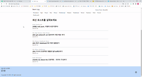
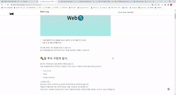
블로그 개편기 EP.2

깔끔하고 내 입맛대로 블로그를 꾸며보고 싶어 시작한 블로그 개편기..!
🔑 소소한 재미 요소
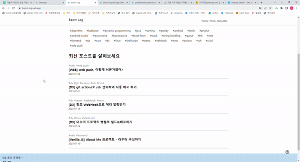
스크롤 시 헤더 변화 & 이미지 배너 변화
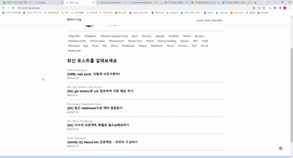
스크롤이 발생하면, 헤더의 색상이 변경되도록 했습니다.
이미지 배너 또한 스크롤 시 scale이 확장되어 보다 더 인터랙티브한 효과를 줍니다.
로고 텍스트 마우스 오버 시 선으로 그려지는 효과
로고 텍스트를 svg파일로 만들어 마우스 오버 시 선들이 다시 그려지는 효과를 주었습니다.
1
2
3
4
5
6
7
8
9
10
11
12
13
14
15
16
17
18
| <svg
:class="[
{ 'fill-white hover:animate-[stroke_1s_linear]': !isScroll },
{ 'hover:animate-[strokeBlack_1s_linear]': isScroll },
]"
width="180"
height="100%"
viewBox="0 0 180 100"
>
<text
y="50%"
:class="`text-xl animate-[${
isScroll ? 'strokeBlack' : 'strokeBlack'
}_1s_linear]`"
>
Beom Log
</text>
</svg>
|
1
2
3
4
5
6
7
8
9
10
11
12
13
14
15
16
17
18
19
20
21
22
23
24
25
26
27
28
29
30
31
32
33
34
35
36
37
38
39
40
41
| text {
stroke-dasharray: 24px;
}
@keyframes stroke {
0% {
stroke: white;
stroke-width: 1px;
stroke-dashoffset: 24px;
}
70% {
fill: transparent;
}
98% {
stroke: white;
stroke-width: 1px;
}
100% {
fill: white;
stroke-dashoffset: 0px;
}
}
@keyframes strokeBlack {
0% {
stroke: black;
stroke-width: 1px;
stroke-dashoffset: 24px;
}
70% {
fill: transparent;
}
98% {
stroke: black;
stroke-width: 1px;
}
100% {
fill: black;
stroke-dashoffset: 0px;
}
}
|
프로필 사진 확대
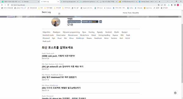
프로필 사진에 마우스 오버를 하게되면 scale이 커지도록 애니메이션 효과를 주었습니다.
tailwindCSS로 편리하게 애니메이션 효과를 줄 수 있습니다.
1
2
3
4
5
| <img
class="m-auto w-24 h-24 rounded-full object-cover border-double border-2 border-slate-300 transition duration-500 hover:scale-125"
src="~/assets/profile.jpg"
alt="profile"
/>
|
운영 시간 카운팅
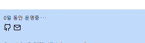
하단 푸터에는 블로그가 현재까지 운영된 시간을 보여줍니다.
페이지 랜더링 시 랜덤하게 일/시간/분/초를 선택하여 보여주며, 바운스 효과를 주어 시간의 흐름을 보여줍니다.
1
2
3
4
5
6
| <div class="flex">
<span>{{ timer }}</span>
<span class="mx-1 animate-[bounce_1s_infinite]">.</span>
<span class="mr-1 animate-[bounce_1s_infinite_100ms]">.</span>
<span class="animate-[bounce_1s_infinite_200ms]">.</span>
</div>
|
1
2
3
4
5
6
7
8
9
10
11
12
13
14
15
16
17
18
19
20
21
22
23
24
25
26
27
28
29
30
31
32
33
34
35
36
37
| let diffDay = reactive({
date: 0,
hour: 0,
min: 0,
sec: 0,
});
const random = Math.floor(Math.random() * 4);
const timer = computed(() => {
const suffix = ["일", "시간", "분", "초"];
const diffKeys = Object.keys(diffDay);
const selectedDiffKey = diffKeys[random] as keyof typeof diffDay;
return `${diffDay[selectedDiffKey]}${suffix[random]} 동안 운영중`;
});
onMounted(() => {
setInterval(() => {
const { date, hour, min, sec } = getDate();
diffDay.date = date;
diffDay.hour = hour;
diffDay.min = min;
diffDay.sec = sec;
}, 1000);
});
const getDate = () => {
const startDate = new Date("2023/08/10 22:30:00");
const curDate = new Date();
const diff = curDate.getTime() - startDate.getTime();
const diffDate = Math.floor(diff / (24 * 60 * 60 * 1000));
const diffHour = Math.floor(diff / (60 * 60 * 1000));
const diffMin = Math.floor(diff / (60 * 1000));
const diffSec = Math.floor(diff / 1000);
return { date: diffDate, hour: diffHour, min: diffMin, sec: diffSec };
};
|
카테고리 마우스 오버 효과
카테고리 필터에 마우스 오버 시 명확한 표시를 위해 확대 및 강조효과를 주었습니다.
1
2
3
4
5
6
7
8
9
10
11
12
13
14
15
16
17
| <ul class="flex mb-8 flex-wrap">
<li
v-for="(category, i) of categoryList"
:key="`category-${i}`"
:class="[
`mr-3 p-1 px-2 rounded-3xl transition duration-500 hover:scale-125 hover:bg-blue-400 hover:text-white`,
{ 'bg-blue-400 text-white': getIsSelected(category) },
]"
>
<a
href="javascript:void(0)"
@click="setCategory({ category }), getPostList()"
>
#{{ category }}
</a>
</li>
</ul>
|
포스트 상세 스크롤 위치에 맞게 달려가는 고양이
1yoouoo님의 블로그를 참고하여 뛰어가는 고양이를 구현했습니다.
스크롤 위치를 계산하여 그에 맞게 left 값이 변화될 수 있도록 했습니다.
1
2
3
4
5
6
7
8
| <div
ref="cat"
:class="[
{ hidden: !catState.isShow },
{ '-scale-x-50': isScrollDown && !catState.isBack },
`scale-50 bg-[url(~/assets/cats.png)] bg-no-repeat absolute w-[112px] h-32 animate-[run_1s_steps(10)_infinite]`,
]"
></div>
|
1
2
3
4
5
6
7
8
9
| @keyframes run {
0% {
background-position: 0 0;
}
100% {
background-position: -1120px 0;
}
}
|
복사하기 시 폭죽 터트리기 & 토스트 메세지 띄우기
wwendy님의 블로그를 참고하여 폭죽 터트리는 효과를 구현했습니다.
폭죽이 터짐과 동시에 우측하단에 토스트 메세지가 나타납니다.
1
2
3
4
5
6
7
8
9
10
11
12
13
14
15
16
17
18
19
20
21
22
23
24
25
26
27
28
29
30
31
32
33
34
35
36
37
38
39
40
41
42
43
44
45
46
47
48
49
50
51
52
53
54
55
56
57
| import copy from 'copy-to-clipboard';
const shareRef = ref();
const { showToast } = useToast();
let particles: Array<any> = [];
onMounted(() => {
window.setTimeout(init, 700);
});
const share = () => {
pop();
const route = useRoute();
copy(`${window.location.host}${route.fullPath}`);
showToast({ text: '클립보드에 복사되었습니다.' });
};
const init = () => {
for (let i = 0; i < particles.length; i++) {
const p = particles[i];
p.style.transform = `translate3d(${p.x}px, ${p.y}px, 1px)`;
p.x += p.vel.x;
p.y += p.vel.y;
p.vel.y += 0.5 * p.mass;
if (p.y > (shareRef.value as HTMLElement).offsetTop * 2) {
p.remove();
particles.splice(i, 1);
}
}
requestAnimationFrame(init);
};
const colors = ['#eb6383', '#fa9191', '#ffe9c5', '#b4f2e1'];
const pop = () => {
for (let i = 0; i < 150; i++) {
const p = document.createElement('particule') as any;
p.x = window.innerWidth * 0.5;
p.y = (shareRef.value as HTMLElement).offsetTop + Math.random() * window.innerHeight * 0.3;
p.vel = {
x: (Math.random() - 0.5) * 10,
y: Math.random() * -20 - 15,
};
p.mass = Math.random() * 0.2 + 0.8;
particles.push(p);
p.style.transform = `translate(${p.x}px, ${p.y}px)`;
const size = Math.random() * 15 + 5;
p.style.width = size + 'px';
p.style.height = size + 'px';
p.style.background = colors[Math.floor(Math.random() * colors.length)];
document.body.appendChild(p);
}
init();
};
|
🎢 To Be Continued..

소소한 애니메이션 효과들을 채워넣으니 만족스럽네요.
지속적으로 운영해나가면서 재미난 요소들로 채워나가야지!